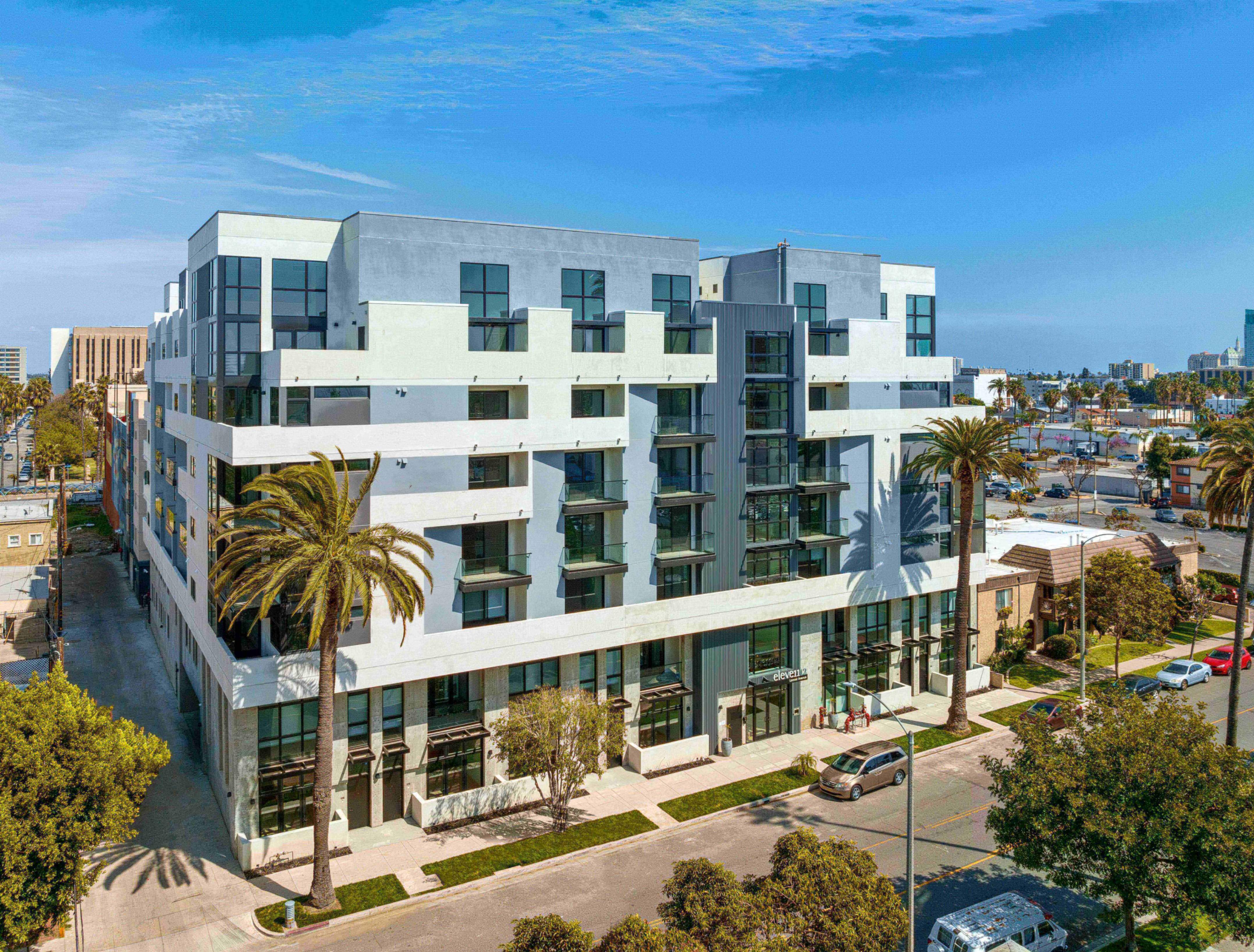
/ Client
Aszkenazy Development
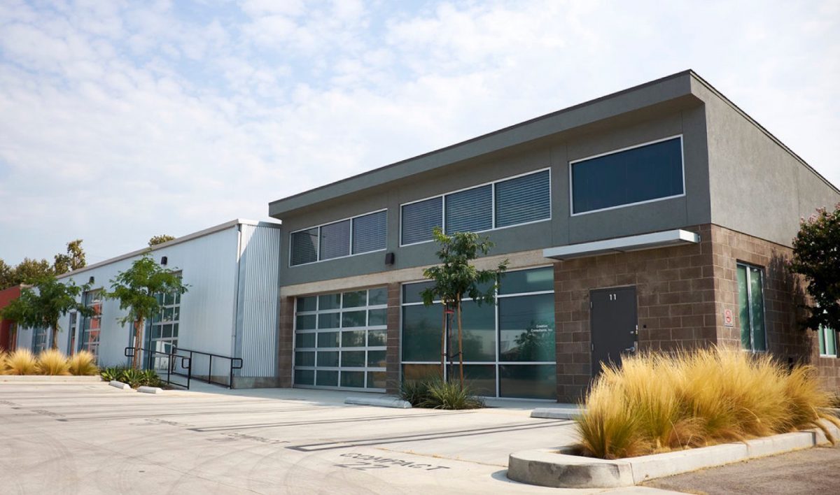
Almost thirty years after its founding, Aszkenazy Development was ready for a brand refresh. We kept the original elements intact and simplified the symbol and typeface to appeal to a more modern demographic.
As part of the refresh we introduced a deep-blue and grey color scheme and designed and built a website that showcases the properties in a sophisticated yet contemporary layout.

The site puts the portfolio first — three-hundred-plus commercial and residential properties across Southern California, presented in the firm’s new deep-blue and grey system. Property cards, mission, services, and the roster of tenants who keep those buildings full.
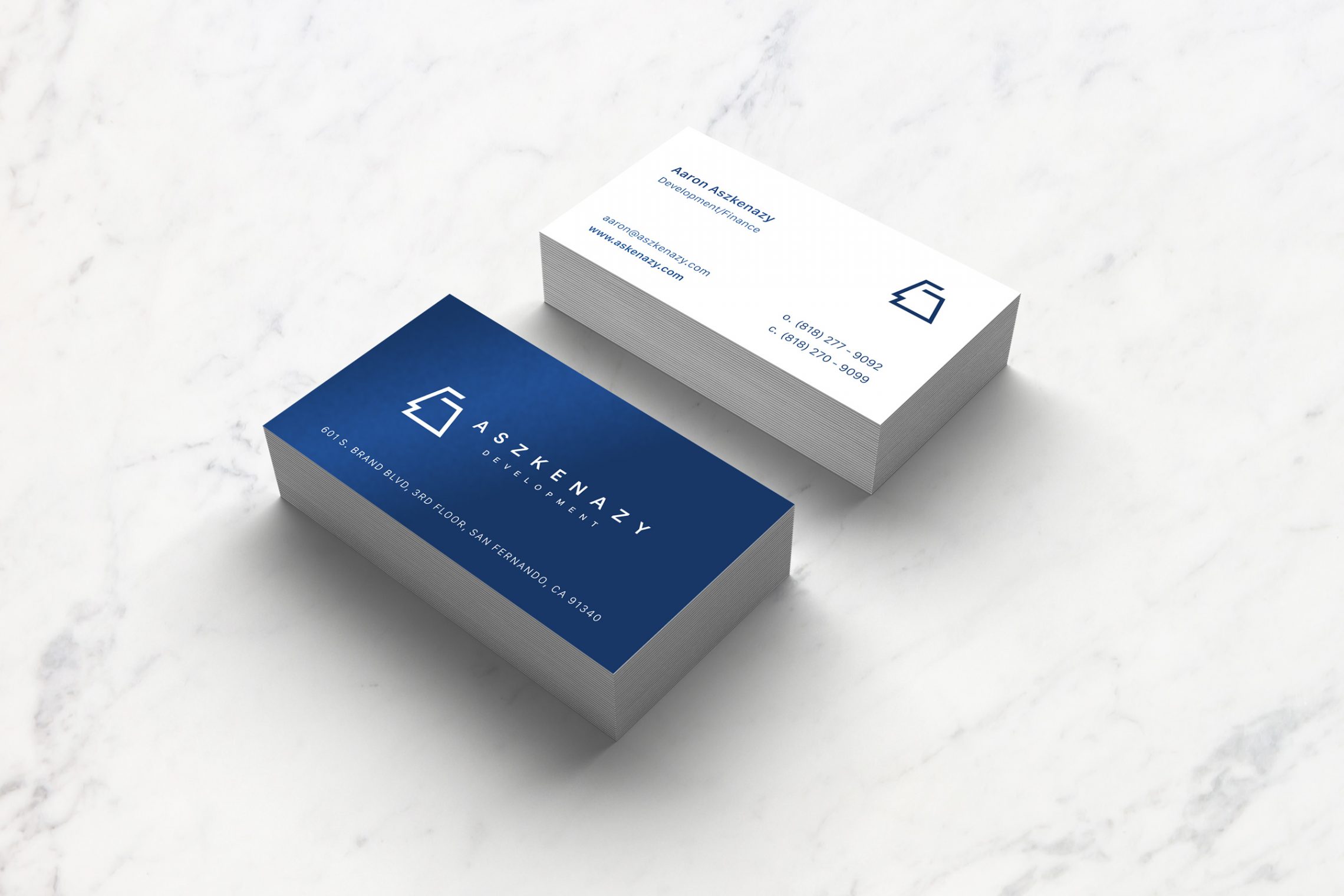
The mark gets the same simplification — the original trapezoidal symbol pared back to a single weight, paired with a clean sans wordmark. Print, signage, and screen all read from the same source.
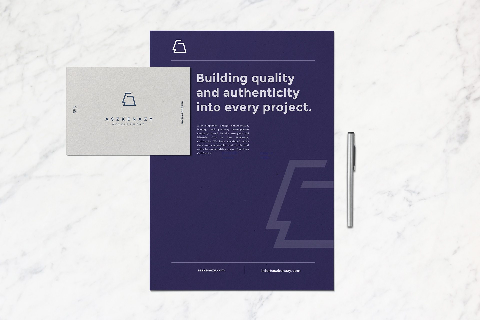
The result
A brand that holds onto thirty years of equity while reading the way a modern developer needs to — confident, restrained, and built to carry from the side of a building to the screen of a phone.